Case Study · Frontend & UI/UX Design
LoadUp Web Application
LoadUp is a junk-removal service. When I joined, the entire business (pricing, scheduling, driver dispatch) ran on phone calls and an Excel sheet. They needed software in 2.5 months: a customer-facing booking widget and an admin tool for CS and partner haulers. I designed and shipped both, and rebranded the company along the way.
- Role
- Design + Frontend
- Team
- 3 engineers
- Timeline
- 2.5 months · NYE launch
- Stage
- Shipped · Early startup
.webp&w=3840&q=75&dpl=dpl_Ekn462zhJ5vhGofMh5XbKKPaVPCk)
Context & Constraints
LoadUp was profitable but fragile. Phones rang faster than reps could answer, and unanswered calls became other companies' customers. The business needed online ordering to survive, not to grow.
- A WordPress site with real traffic. The booking flow had to embed as a React widget, not live on a separate domain.
- No brand system. The old logo was the word "LoadUp" in orange. I rebuilt the mark in green and locked the system in two weeks.
- Three engineers. No design team, no QA, no PM. A lead, a senior, and me on design + frontend. Rails backend, React frontend, a deadline on New Year's Eve. We worked through Christmas, and whoever was nearest the problem fixed it.
I owned the brand, the booking-flow UX, and half of the frontend. I influenced product via CS interviews and LogRocket sessions. I didn't touch backend. The Rails API, payments, and dispatch lived with the lead and senior engineer.
The Problem
Customers couldn't see a price without a phone call. CS could double-book a driver. Haulers wanted end-of-day pay, so someone tallied dues by hand every night.
The rules that priced, scheduled, and paid all existed. They just lived in human heads and Excel rows.
Research & Constraints
- CS named scheduling as the biggest problem. Not pricing, not item entry. When. Every call became a negotiation over pickup windows.
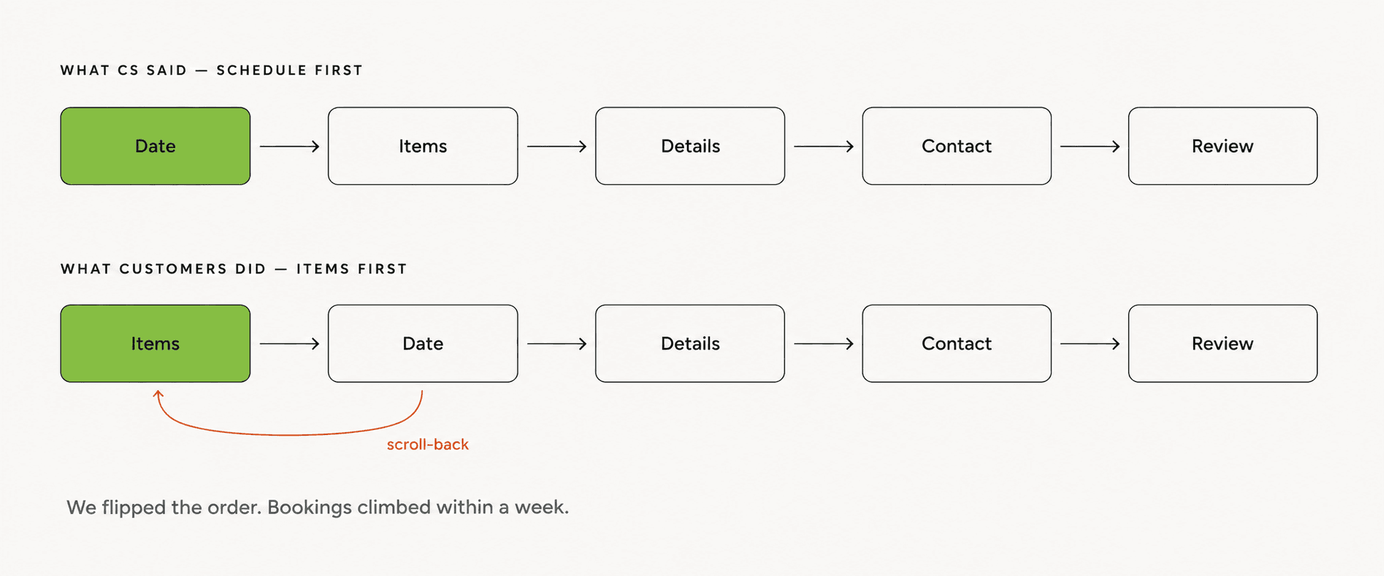
- The first flow opened with scheduling. Five steps: date, items, details, contact, review. It matched what CS told us. It didn't match what customers did.
- LogRocket told a different story. Customers scrolled past the calendar to find the item picker first, then scrolled back up. They wouldn't commit to a Tuesday morning until they knew whether they were booking one couch or the whole basement.
- The widget had to embed into WordPress. A React widget, not a separate app, style-isolated and light enough not to break the marketing page.
Decisions
Items first, schedule second
(both)The first flow opened with a calendar, the order CS asked for. LogRocket said customers were scrolling past it. We flipped the sequence to items-first, live-tested for a week against the original, and watched bookings climb.
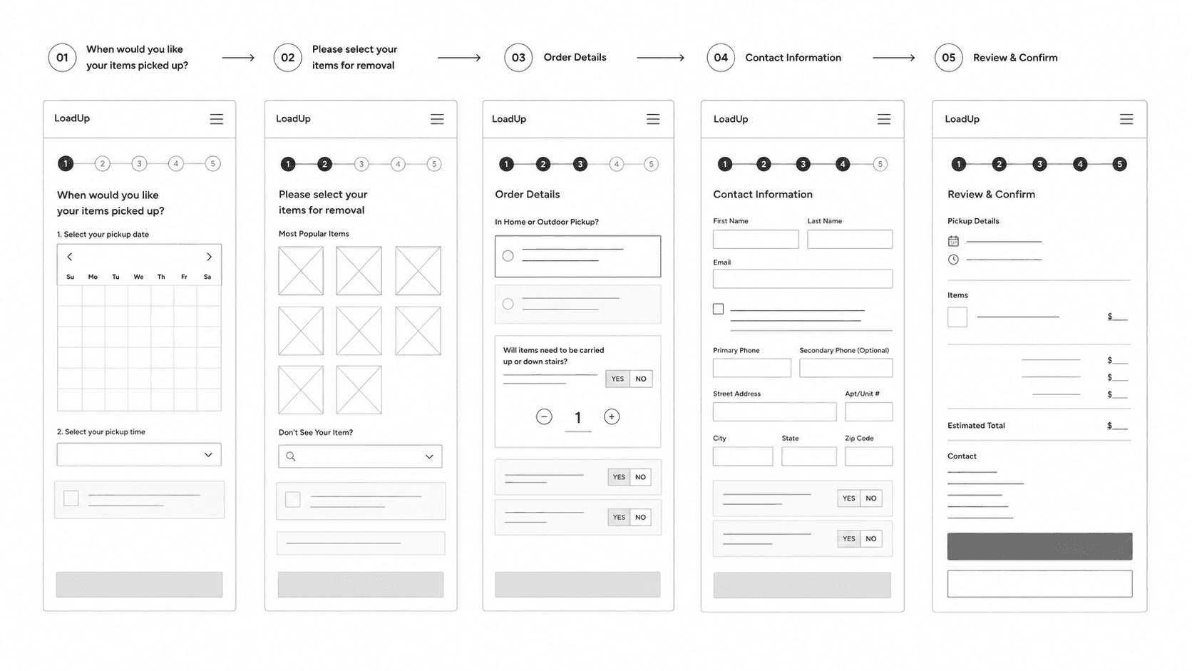
The public flow no longer matched the CS team's mental model. To keep them from fighting the new system, the admin view stayed scheduling-forward, the same sequence they'd used for years, just on a screen instead of a spreadsheet.
Brand system, in two weeks
(design)The old mark was "LoadUp" in orange: functional, forgettable, indistinguishable from every other dumpster-orange competitor.
To pick a direction, I ran a quick color-emotion test with the CS team. I showed them logo treatments in different colors and had them stick notes with whatever words came to mind. Green pulled "clean," "trusted," "eco." That settled it.
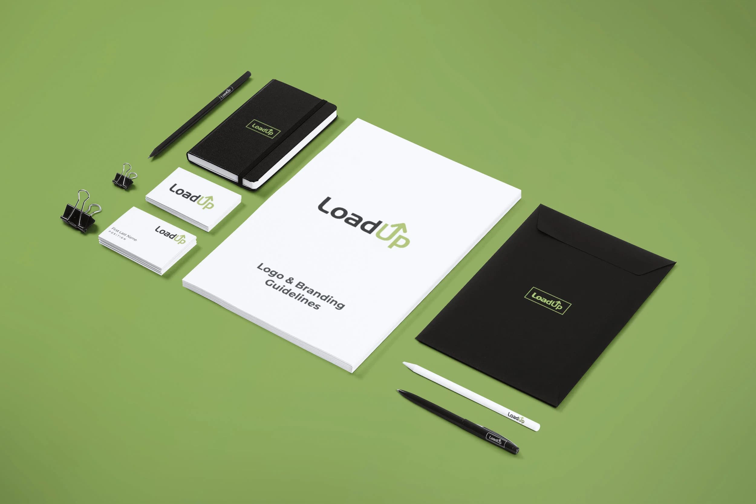
I rebuilt the mark in sapling green: a sustainability cue, and distance from the orange pile. Then I locked the system, mark, palette, type, and basic guidelines, in two weeks.
Outcome
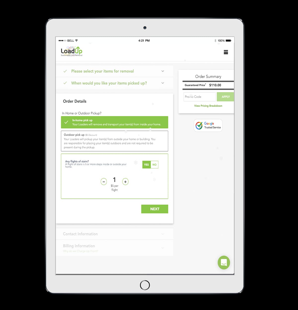
The booking widget
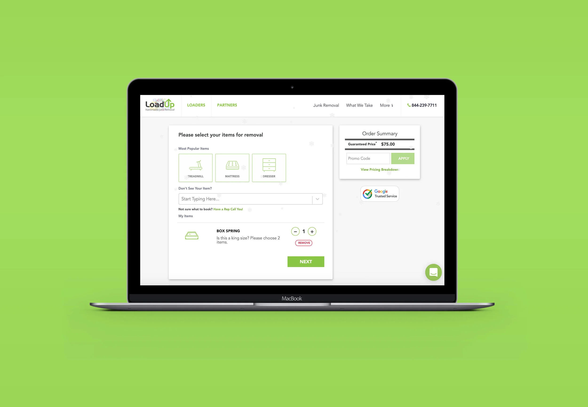
An items-first widget embedded in the WordPress marketing site. Customers picked from a catalog, answered follow-ups about labor, and watched a running price climb. The form elements stayed big, square, and unfashionable. Most customers were older homeowners on a tablet, and a tasteful 14px input would have lost half of them.
The item catalog wasn't complete at launch. We shipped the high-frequency pickups; the long tail was real: weird shelving, hot tubs, half a deck. Anyone with one of those still ended up on the phone.
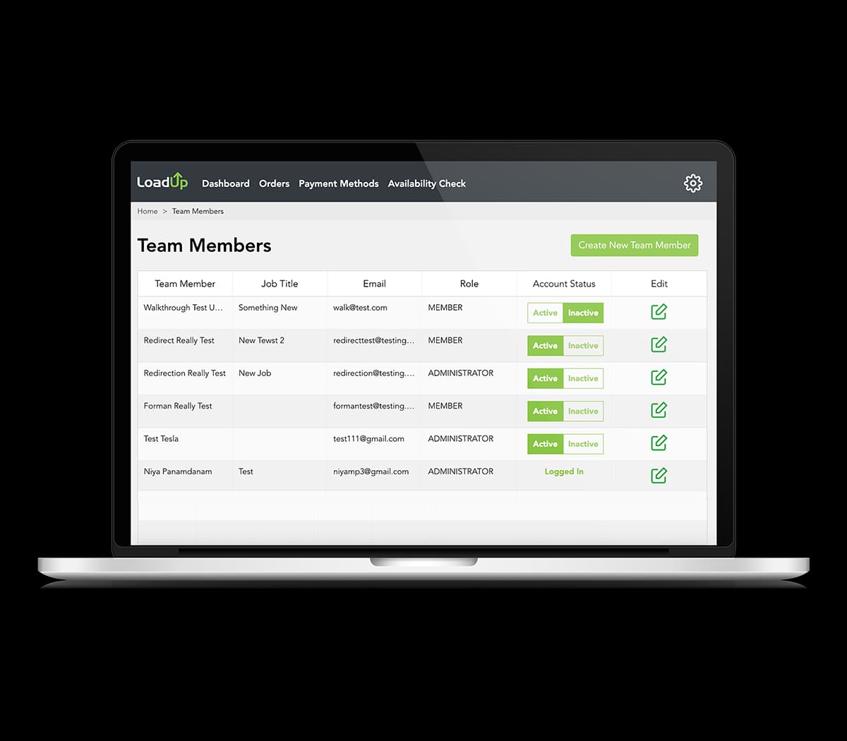
The partner / admin dashboard
CS reps logged into a table of every order, sorted by date and time. Clicking a row opened items, contact, notes, and the driver-assignment screen.
- Double-booking dropped. Not to zero, but the constraint finally lived in software instead of in a rep's head.
- Payouts ran on rails. End-of-day stopped being a tally session. The tracker built up dues as orders moved through; closing the day meant invoices and approvals.
- CS moved faster. Tabbing between orders instead of rebuilding context from a spreadsheet every time.
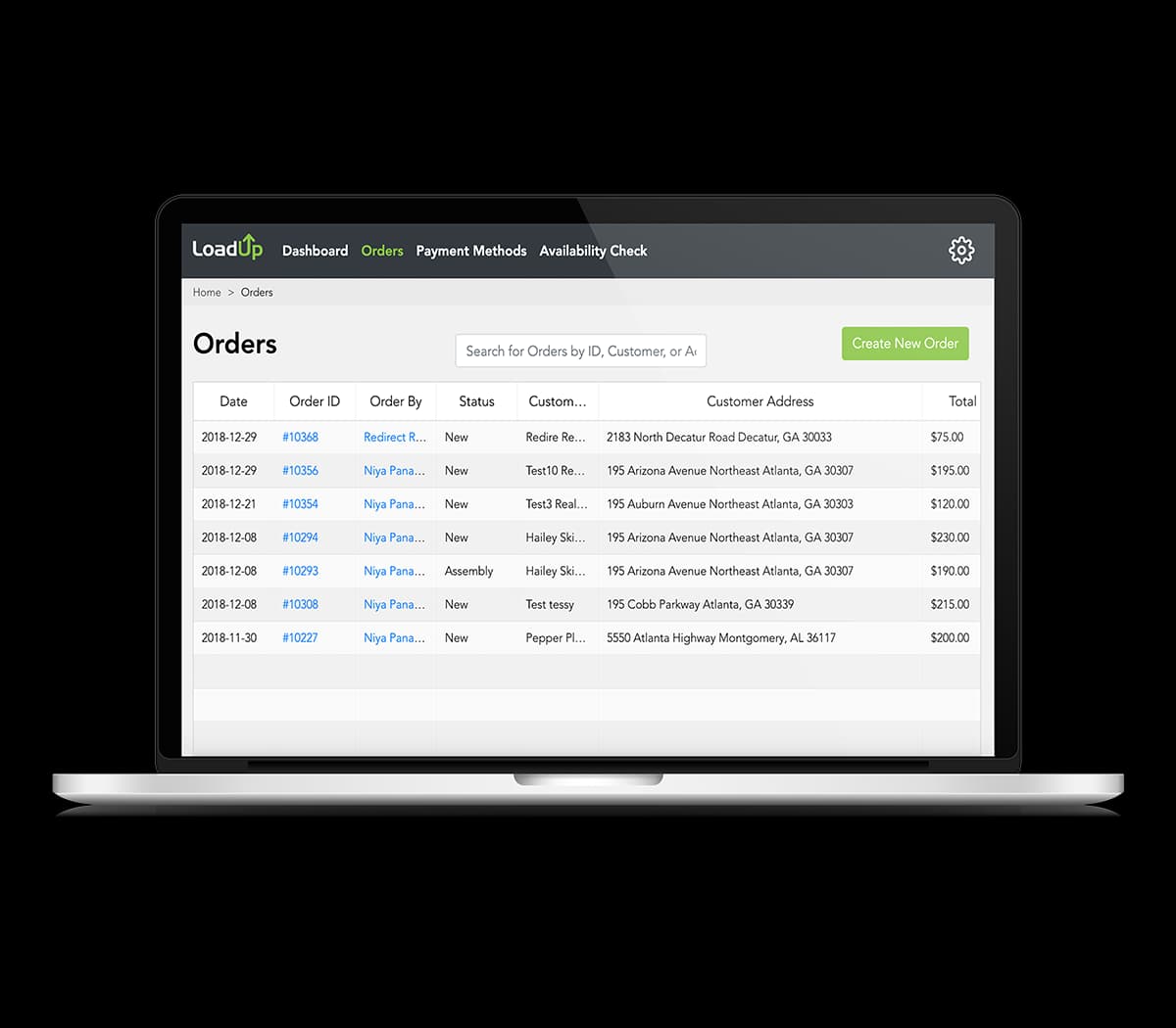
The order management view
Inside the dashboard, the order detail was where the work actually happened. Line items, customer info, pickup window, and a running total in one place. Reps confirmed an order, took payment, and assigned it to a driver without leaving the screen.
The brand system
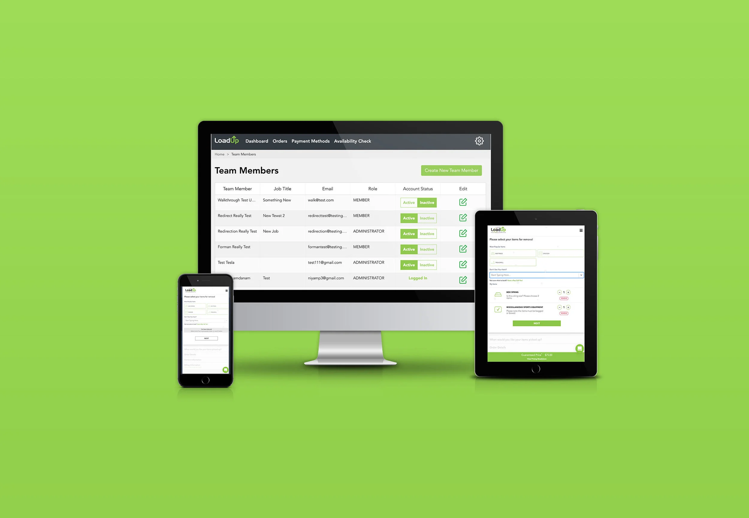
The sapling green ran across every surface we shipped: wordmark on the widget, palette on the admin tool, the same type system on both. Brand cohesion is the cheapest way to make three things built in parallel feel like one company.
Reflection & Growth
What worked about owning both
Decisions moved at the speed of one person changing their mind. When LogRocket surfaced something unexpected, I redesigned the step and shipped the change without a handoff. The senior engineer stayed free for the harder backend problems.
What I'd improve
The brand work. Two weeks was enough to lock and ship a system, not enough for real market research or wordmark iteration. The decisions leaned on brands I admired and on what felt distinct from the dumpster-orange pile.
What I learned
My instinct toward minimal interfaces would have lost half of LoadUp's customers. Older homeowners on tablets needed bigger icons, bigger click targets, more space around the actions. The job wasn't to make the interface I wanted to look at.
With more time
More user research on the CS side. The admin we shipped was a faster spreadsheet. Another month would have meant shadowing reps and solving the geographic-bundling problem properly.
LoadUp couldn't scale on phone calls and Excel rows. By New Year's, it didn't have to.
Niya Panamdanam · Design + Frontend