Case Study · Frontend Engineering
Healthie
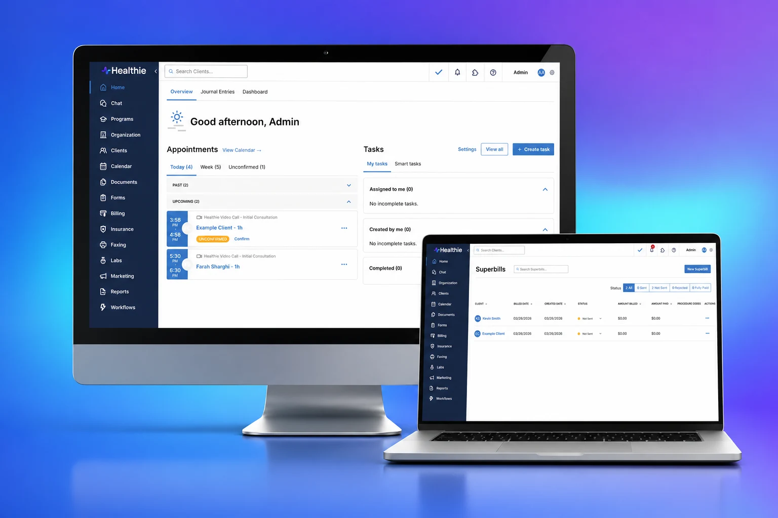
Healthie is an EHR and practice-management platform, the software a clinic runs its whole day on. I spent four years there as a frontend engineer, the last three as Principal, owning React architecture across four product teams as the company grew past 100 people and raised its Series B. This is two pieces of that work: shipping brand theming so customers could make Healthie look like their own product, and rewriting the scheduling calendar a million-plus users lived in.
- Role
- Principal Frontend Engineer
- Team
- Led 3 engineers
- Timeline
- Jul 2021 to Aug 2025 · 4 years
- Stage
- Shipped · In production
Overview
I joined Healthie as a senior engineer and left as Principal Frontend Engineer, owning frontend architecture across four product teams plus the enterprise solutions group. Along the way I built the company's first design system, cutting 1000+ one-off components down to 80+ standardized ones, set up Storybook, and got the frontend build from over 60 seconds to under 7.
Principal meant speccing work, sequencing tech debt against product, and reviewing across teams. But on the two projects here I was also the one at the keyboard. I built branding first, and while it was rolling out I moved to the appointments rewrite. They were the most recent work I did as primary engineer, on top of everything else the role asked for.
Context & Constraints
- A codebase scaling faster than its conventions. Healthie went from 50 to past 100 people and raised a Series B while I was there. Four product teams and the enterprise group all shipped into one React frontend.
- A million-plus users who could not be interrupted. This is software clinics run their day on. Scheduling especially was load-bearing. A bad deploy there is a provider who cannot see their day.
- A design system, half of it one I had to build. Both projects had to land inside the system I was standardizing: the same 80-plus components, the same Storybook, the same markdown workflow that let designers push Figma updates straight in.
- Principal on paper, primary author in practice. I was speccing and allocating across teams and still writing the core of these two features myself. The constraint was my own attention as much as anything technical.
On both projects I owned the spec, the frontend architecture, and most of the implementation.
- Branding. I consulted design on the rough layout and got sign-off, then laid it out and built it myself, working with a backend engineer on the data model and the org-level permissions.
- Appointments. I led the frontend and embedded with the scheduling product team for the length of the project, setting the architecture and writing the core state and filtering logic myself, all while keeping up my other responsibilities.
The Technical Problem
The two anchors started from opposite kinds of pain. One feature did not exist yet and customers kept asking for it. The other existed, worked, and was held together with tape nobody wanted to touch.
- Healthie offered white-label, but you could not change its colors. Enterprise customers wanted Healthie to look like their product for their staff and their patients. There was no UI to theme it, and no model for who in an organization was even allowed to.
- The calendar was the most-used screen and the least safe to touch. It ran on a CommonJS fork of react-big-calendar, and the logic around it had drifted past the point anyone wanted to touch:
- The fork pinned us to old, buggy moment.js and blocked the Node 18 and npm upgrades the whole frontend needed.
- The core views were class components where it was hard to say when state would change.
- Filters auto-applied on every selection, so one could quietly reshape another.
- On day view a user could load 100+ providers at once and stall the app for 4+ minutes.
- Testing was thin because nobody could say which filter affected what.
Both were load-bearing features with no safe seam to change them. The work was as much about cutting that seam as shipping the feature.
Architecture & Approach
Branding Project: the shape was a settings surface that writes a theme to the organization and a layer that applies it across the provider app and the patient portal, gated by org-level permissions.
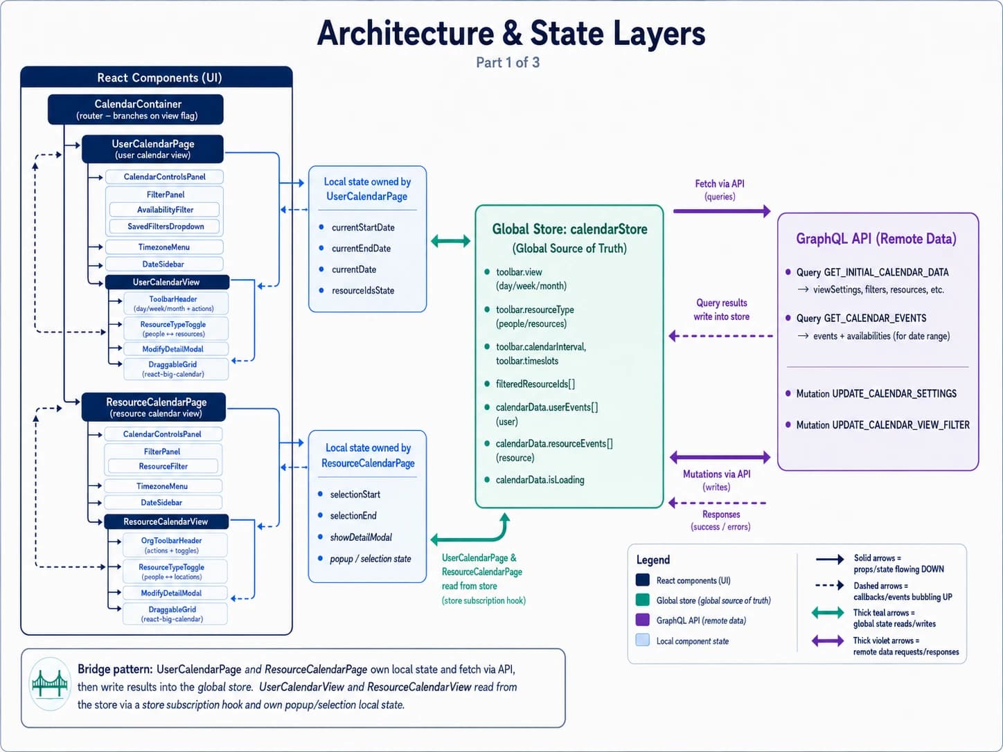
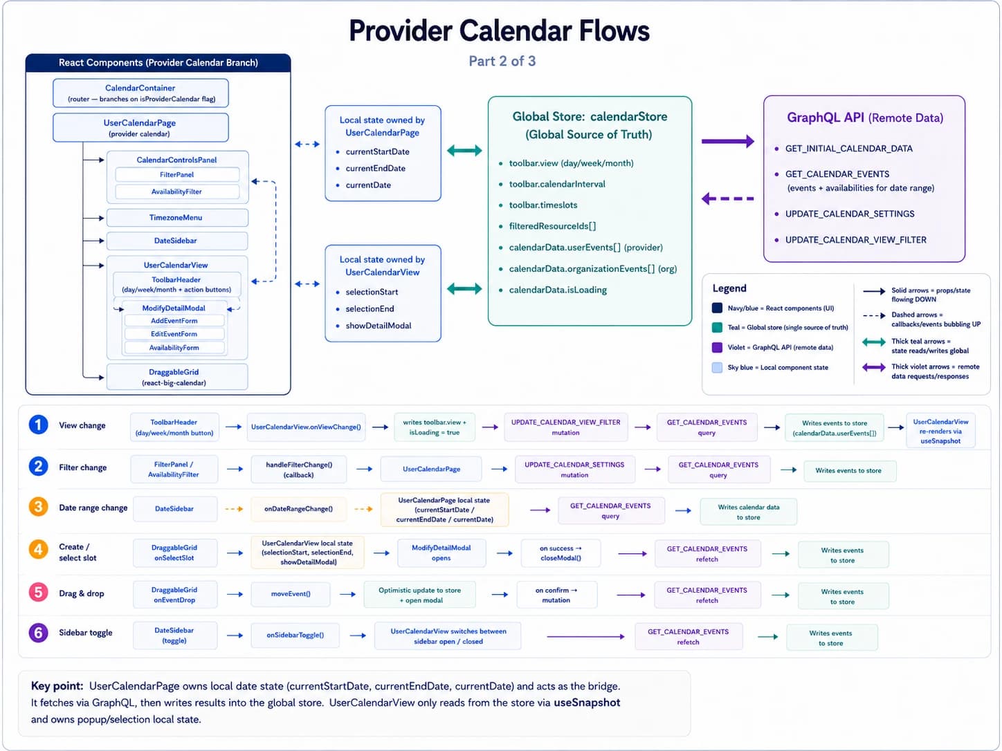
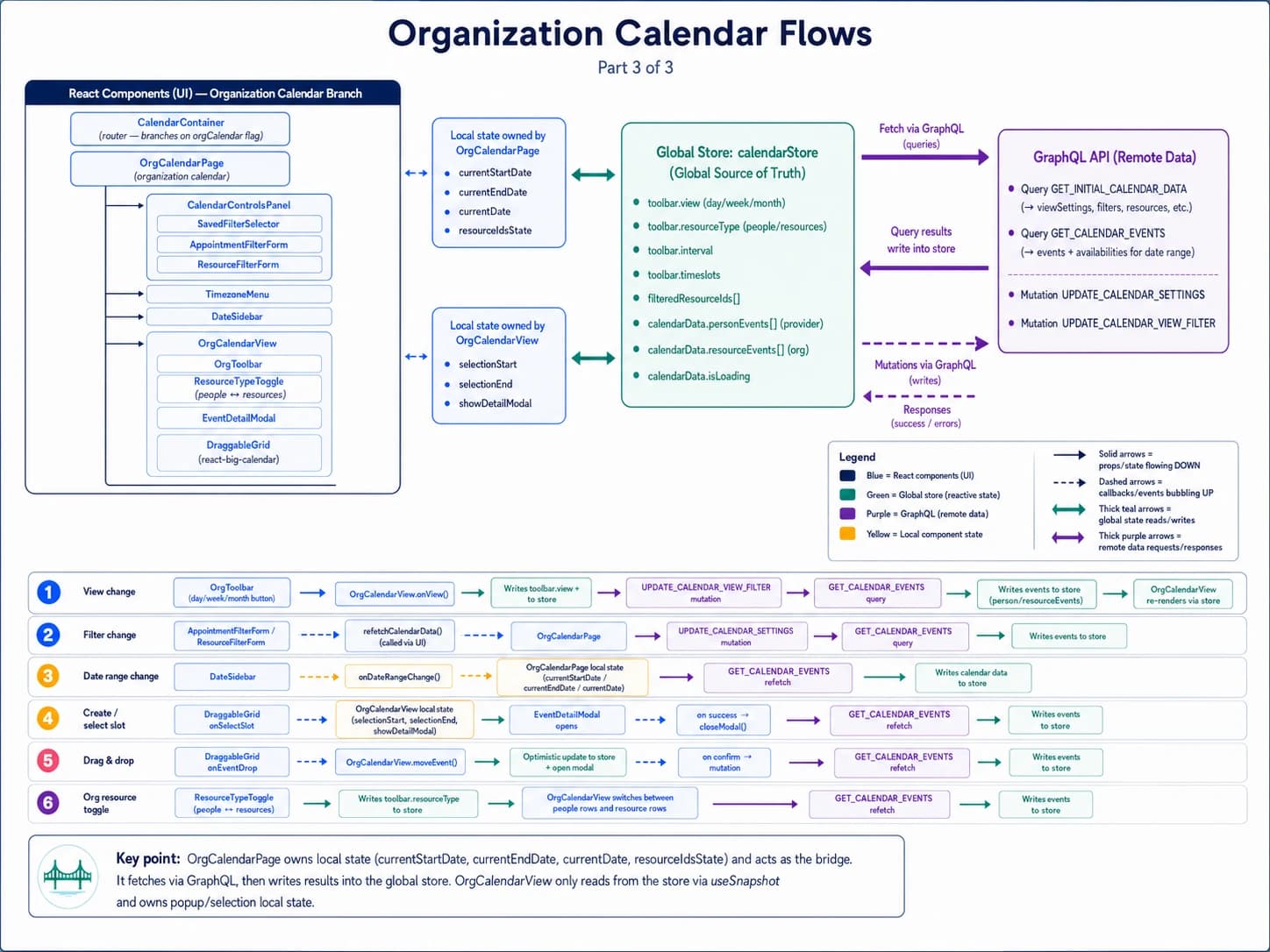
Calendar Project: the shape was to pull the calendar out of tangled class components into one observable store, split the organization and single-provider views, and make every filter its own tested unit. One Valtio store is the source of truth; Apollo handles the fetching; the component tree reads down and writes up through that single store.
Valtio over Redux for calendar state
A proxy store wired to Redux DevTools, so any dev could watch the state and see what triggered each change. The calendar had to become traceable before it could become testable. The call was made early, while the views were still class components: Valtio worked with them as they were, where Redux would have meant rewriting the whole app.
A smaller community and less convention than Redux, traded for a mutable mental model the team could actually follow.
date-fns over moment.js
Moment was old, unmaintained, and the source of real bugs. date-fns is immutable and tree-shakeable, and it unblocked the library upgrades behind it. The migration was its own project, run by another engineer whose work I specced and managed.
Rewriting every date call in the calendar by hand, then testing each one across browsers and timezones to be sure it held.
react-big-calendar latest, off the CommonJS fork
The fork was what pinned us to old moment and blocked Node 18 and npm. Moving to the latest stable release unblocked the entire frontend, not just the calendar.
Reconciling the fork's custom behavior against upstream, the riskiest part of the migration.
Latest react-select for the filters
The old select could not do clean multi-option selection or clear. The new one could, and it matched the rest of the Healthie UI.
Re-theming every filter to fit the newer design system.
State changes only at the top-level component
One place seeds the initial filters, one place mutates them. It made the difference between settings being set up and settings being changed obvious, which is what made the saved-filters feature easy later.
More deliberate prop and state threading instead of mutating wherever was convenient.
Implementation Highlights
Brand theming
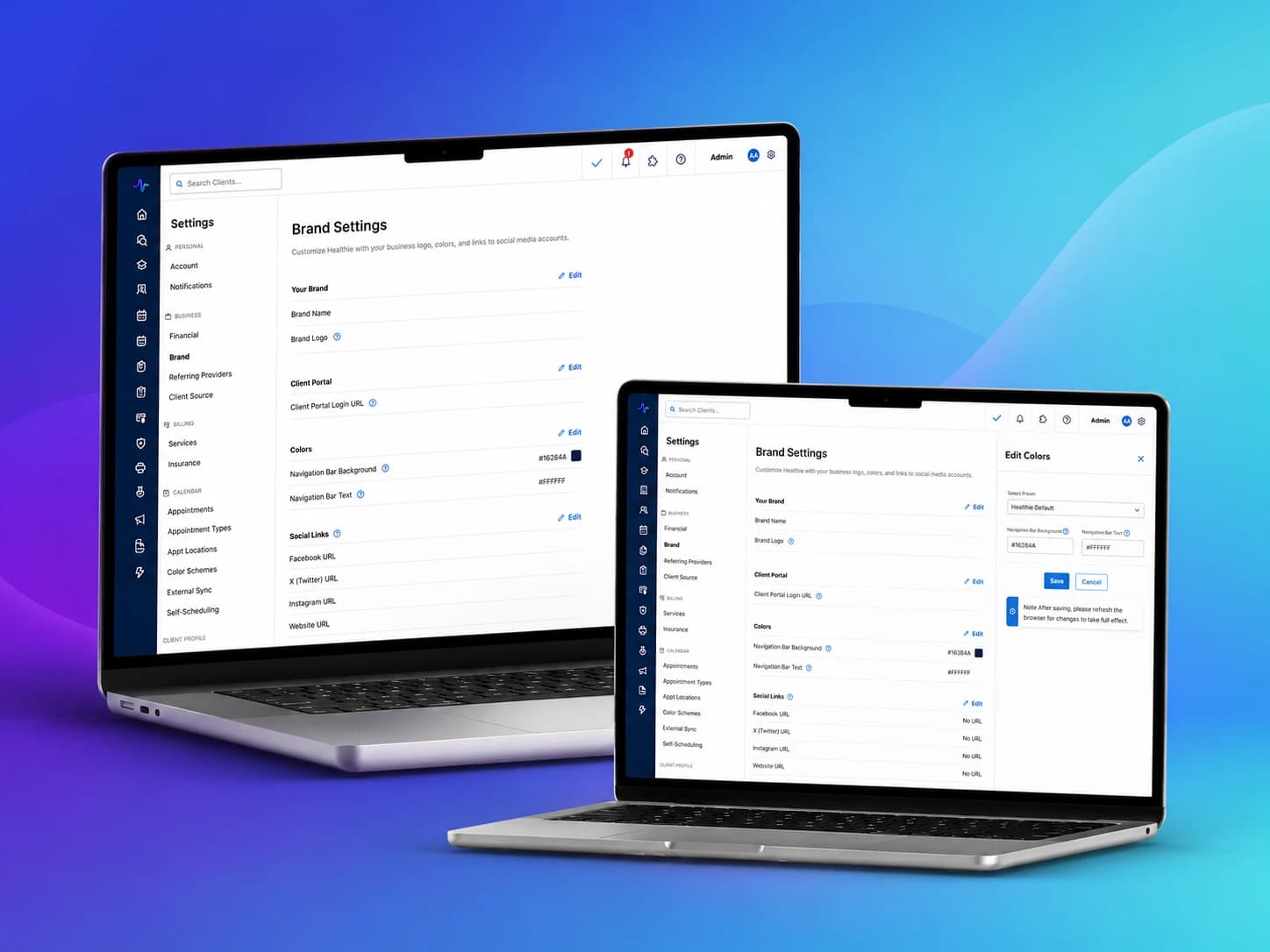
The brand settings page lets an organization set its name, logos, portal name, and a palette: background, nav bar, accent, buttons. I built the color editor to match Healthie's other settings, previewing each change against the live chrome instead of a swatch in a vacuum.
- Permissions, not just colors. A backend engineer and I worked out the data model and which roles can change branding, so a junior staffer can't repaint the whole practice.
- Themed end to end. The palette applies across the provider app and the patient portal, so the same screen renders in Healthie's default blue or a customer's maroon with no code change. That is the whole point of white-label.
I consulted design on the rough layout and got sign-off instead of running a full design cycle. With six weeks to ship, that beat a back-and-forth, at the cost of a settings surface that's consistent but not bespoke.
Three bugs shipped where the theme didn't resolve for users on different pricing tiers or their patients. Each was fixed inside a day, the worst under 48 hours, but they only surface once real orgs with mixed plans turn the feature on.
Appointments rewrite
We kept the UI close to what users knew. Working with design, we tightened spacing, consolidated buttons, and borrowed a few patterns from Google Calendar so the screen could hold more where it mattered. The class components and old libraries went away underneath, but the muscle memory stayed.
- Two views, split apart. Organization view for admins seeing scheduling across the org, with the heavy filtering; single-provider view focused on the logged-in provider with a lighter set. Each could be reasoned about and tested on its own.
- Every filter its own tested unit. Each filter became a component with unit tests against the component and its logic, and where one filter affected another, that pair got documented and tested together.
- Traceable state. State moved into Valtio so any dev could open Redux DevTools and watch what changed and when, with the core transitions pulled up to the top-level component.
- Guardrails on the unsafe states. Org day view no longer auto-selects every provider. Pick nobody and you get a blank calendar, not a 4-minute stall. Selection is capped at 20.
- Debounced and batched fetches. A burst of filter changes triggers one fetch instead of ten. That's most of where the speed came from.
- Saved filters, almost for free. With one place owning applied state, a saved filter set just works, instead of being another tangle.
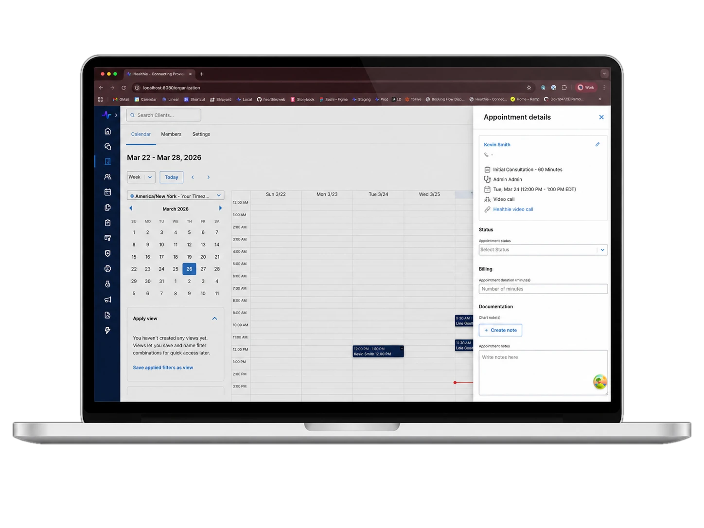
I'd have preferred filters that apply on submit, the clean fix for filters reshaping each other, but legacy users were used to instant, so we kept it. On day view we added a horizontal scroll so power users could cram more providers across narrow columns. Not pretty, but redesigning it needed product to first decide who the feature was for.
Batching cleaned up the initial load but is still iffy across rapid multi-filter changes. Worst-case heavy fetch is under a minute now instead of 4+, and under a minute is still a number I'd rather not ship.
Rollout & Validation
Branding shipped on its six-week timeline. Appointments rolled out gradually, behind a feature flag, under the million-plus users who depend on it. The numbers that mattered were less about new capability and more about the floor coming up under reliability and speed.
- 4+ min → <1 min
- Worst-case calendar fetch, after guardrails, debounce, and batching.
- Weeks → days
- Bug response time in the calendar, once the logic was split into tested units with traceable state.
- 3 bugs · <48h
- Theming edge cases across pricing tiers and patient views, caught and fixed right after launch.
- 1M+ users, no outage
- Appointments rolled out behind a feature flag. The few times we hit an issue, we flipped it off, fixed it, and rolled forward again.
Reflection & Growth
What worked
Treating the rewrite as plumbing first and feature second. Splitting the views, moving state into Valtio, and making each filter a tested unit meant the new filter options product wanted stopped being too risky to add. The scary part was never the UI. It was not knowing what the UI would do.
What I'd improve
The branding rollout. Three theming bugs across pricing tiers and patient views means I did not map the plan-and-role matrix carefully enough before shipping. A handful of test organizations on mixed plans would have caught them first.
What I learned
How much of a redesign is really permission to change the code underneath. Users barely noticed the appointments UI move, which was the point, and it bought us a calendar we could finally test and extend. Restraint on the surface paid for freedom under it.
With more time
Apply-on-submit filters and a proper day-view redesign. Both were left half-solved to avoid jarring legacy users, and both need product to commit to who the feature is really for before the engineering can be clean.
Healthie runs other people's workdays. The hard part of changing the features they lean on most is making sure they barely notice you did.
Niya Panamdanam · Principal Frontend Engineer